Are you new to Data science? are you still trying to get your first project up and running? if this is you, you are in the right place.
In this article, we will build a data science project together, or should I say you will build your first data science project using your own Netflix data. It is not always easy getting the right dataset for a data science project, so why go through that stress when you can easily get your own data from Netflix, and convert it into a dataset since Netflix allows you to download your complete watching history which you can actually use to build cool data science projects.
We will make use of some Python libraries (Pandas and Matplotlib) and at the end of this article, you should have a project that can be added to your portfolio.
Prerequisites
Basic knowledge of Python, Pandas and Matplotlib.
Pandas and Matplotlib installed on your computer but if you don't have them installed already
pip install pandas&pip install matplotlibto install them.A Netflix account.
🎯 Get the raw data
For us to be able to build this project, we will need data. We can get the raw data by following these steps:
Login to your Netflix account.
Navigate to the Get my info page and request your data.
A confirmation email will be sent to you, make sure to confirm it.
An email will be sent to you that your download is ready.
Note*: this might take a while to come.*After you download the zip file, you should see these directories.
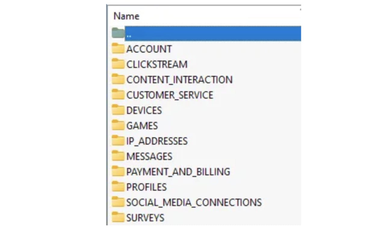
- Click on the CONTENT_INTERACTION folder and open the ViewingActivity.csv file, this contains your full watching history.
🎯 Let’s examine the data
We will use our knowledge of Pandas to examine the data and see what we have. But first, let's import the ViewingActivity.csv file into our notebook and read it as a Pandas dataframe.
import pandas as pd
df = pd.read_csv('ViewingActivity.csv')
Let’s have a look at the first set of rows that we have.
df.head()
Let’s see the number of rows and columns that we are working with.
df.shape

#output: (9273, 10)
From the dataset, we have 10 columns.
Profile Name — This shows the profiles of people sharing a Netflix account.
Title — This column contains the names of the series a particular user is watching.
Start Time & Duration — This shows us when and also for how long did a user on the profile watch a movie.
Device Type*—* This contains the different devices used to watch these movies.
Country — The location(Country) where the particular profile is watching from.
You can check out the remaining columns.
Before we can work with the data in more detail, we need to understand the underlying data types.
df.dtypes
From the result, we see that all the columns store the data in the object data type.
🎯 Getting the number of users on the Netflix account
We can get the number of people that we share the same Netflix account with, all we have to do is find the unique users within the Profile Name column.
df["Profile Name"].unique()
🎯 Getting the number of devices watching on the Netflix account
In the same way we found the number of users on the Netflix account, we can also find the number of unique devices watching movies on the account.
df["Device Type"].unique()
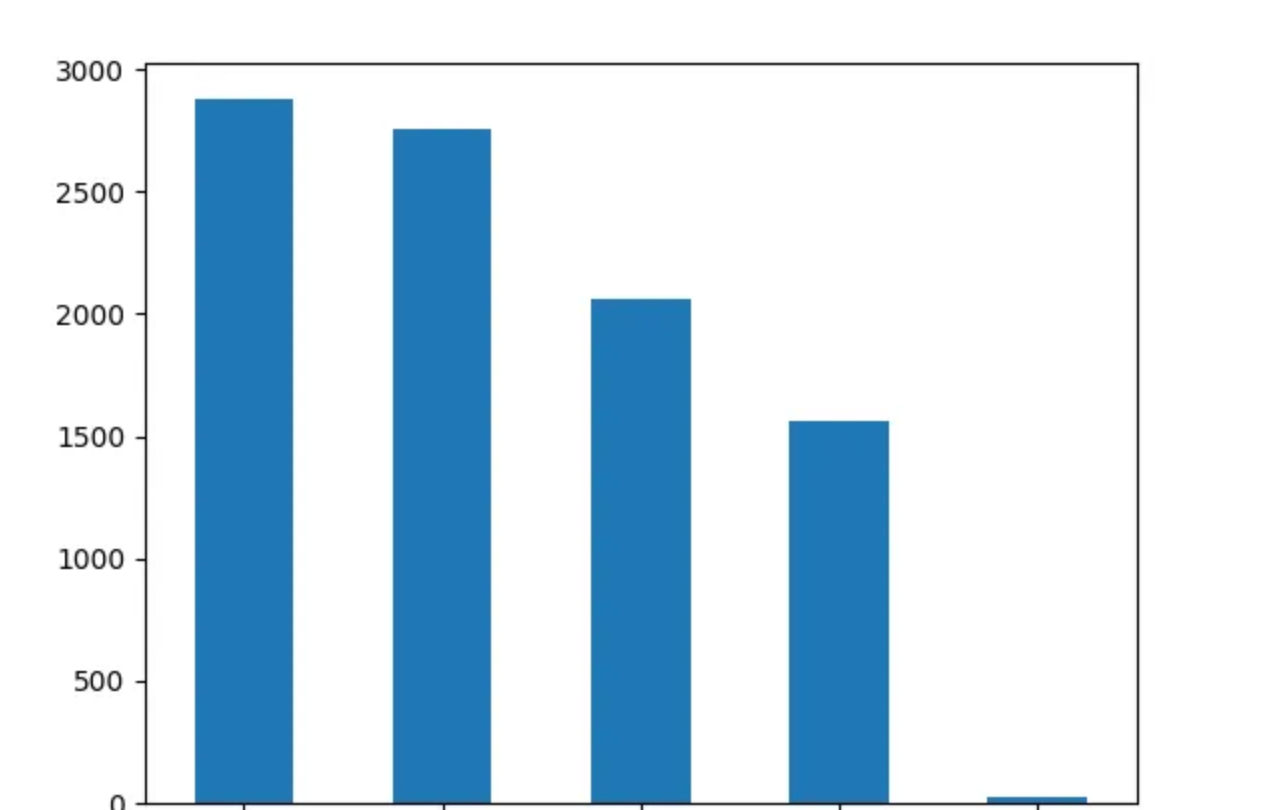
🎯 Getting the profile with the most viewing and activities
We can find out which of the users is interacting and watching the most amongst the whole users on the Netflix account. We will use the DataFrame.value_counts() method to count the number of row occurrences
df['Profile Name'].value_counts()
Using Matplotlib, we can easily visualize this.
%matplotlib inline
import matplotlib
import matplotlib.pyplot as plt
df['Profile Name'].value_counts().plot(kind='bar')
plt.show()
The output looks like this:
🎯 Getting the profile with the most-watched time
In order to get the user that watched movies the most, we have to go through several steps.
The first thing to do is to transform the Start Time and Duration columns into a DateTime format.
df['Start Time'] = pd.to_datetime(df['Start Time'], utc=True)
df['Duration'] = pd.to_timedelta(df['Duration'])
The next thing is to check the overall viewing duration for all profiles.
df['Duration'].sum()
Let’s find the viewing duration for each profile.
df.loc[df['Profile Name']=='Add your profile name','Duration'].sum()
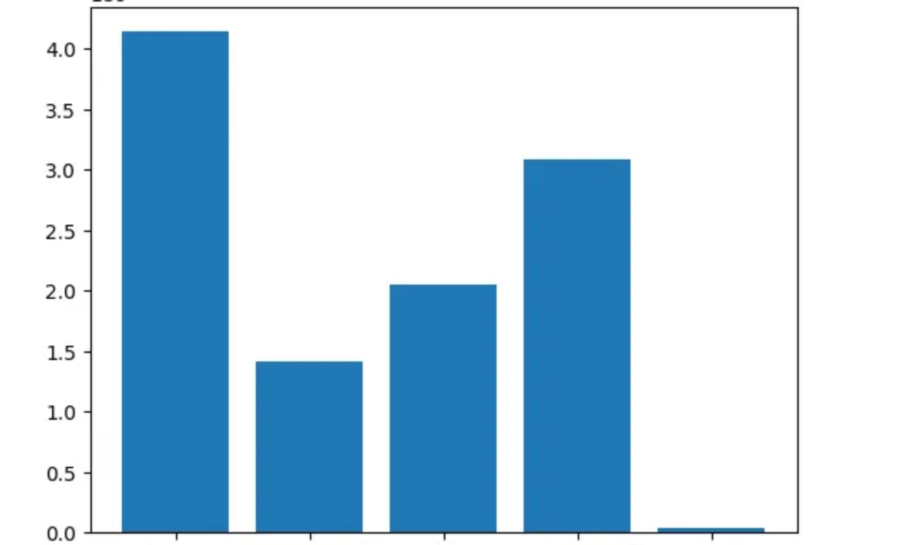
From the result, we will notice that we have the same order as the profile with the most activities. So that means that the profile with the most activities also has a higher watch time.
The visualization is not that easy, because a Timedelta is nothing that can be plotted using Matplotlib. So we have to perform another Transformation with NumPy’s astype method.
df.loc[df['Profile Name']=='Your profile name','Duration'].astype('timedelta64[s]').sum()
So we can now create a dictionary to store the overall watch time per user in seconds.
watchTime = {}
watchTime.update({"First Profile": df.loc[df['Profile Name']=='First Profile','Duration'].astype('timedelta64[s]').sum()})
watchTime.update({"Second Profile": df.loc[df['Profile Name']=='Second Profile','Duration'].astype('timedelta64[s]').sum()})
watchTime.update({"Third Profile": df.loc[df['Profile Name']=='Third Profile','Duration'].astype('timedelta64[s]').sum()})
The dictionary looks like this:
{'First Profile': 4138000.0, 'Second Profile': 1411573.0, 'Third Profile': 2050125.0,}
So we can now plot the bar chart.
%matplotlib inline
import matplotlib
import matplotlib.pyplot as plt
plt.bar(*zip(*watchTime.items()))
plt.show()
🎯 Getting the devices used by a user, and which device is used the most
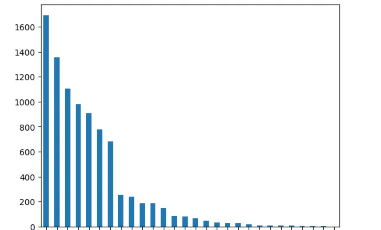
We will first have a look at the Device Type column and see the devices used by each user, they are actually plenty (some were even used just once while some were used frequently).
df['Device Type'].value_counts()
We can again quickly plot this in a bar chart.
df['Device Type'].value_counts().plot(kind='bar')
plt.show()
We can now filter them based on each user(just in case you want to know how many devices you used)
df_device = df.loc[df['Profile Name'] == 'Your profile name']
df_device['Device Type'].value_counts()
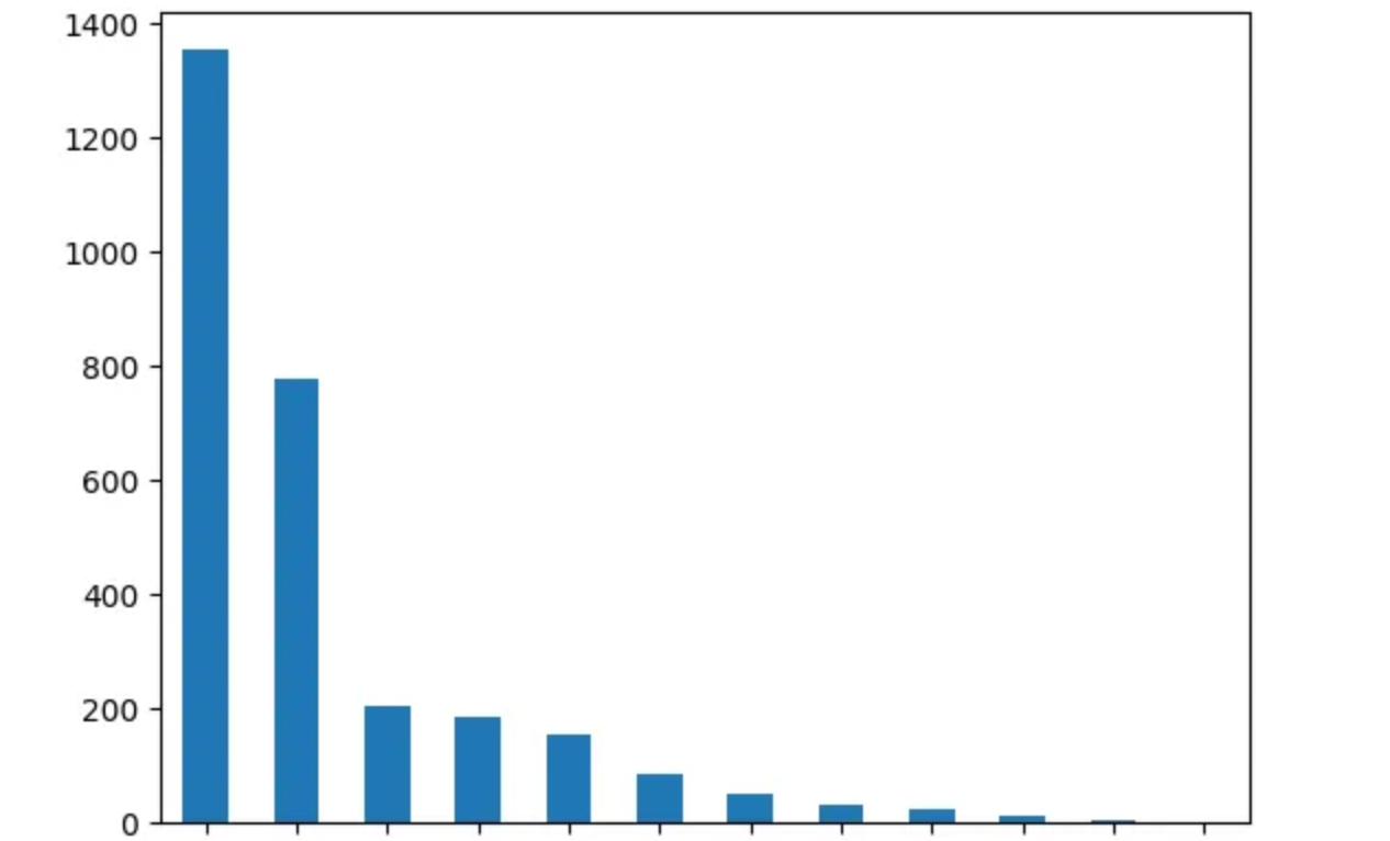
We will see the see device name and the number of times it was used by that particular user. So we can plot the bar chart now.
df_device['Device Type'].value_counts().plot(kind='bar')
plt.show()
Conclusion
In this article, we were able to cover a simple data science project, download raw data from Netflix, analyse and visualize the data. As you can also see that we answered a number of questions using the dataset and trust me more questions can still be explored. I am curious to know know what project ideas you get from this article and what you build.
In the meantime, how about you answer these questions with the dataset:
The most popular/watched title.
A movie watched by all users.
Recommend a movie for one user based on the common watching history of other users.
Let’s connect on Twitter and on LinkedIn. You can also subscribe to my YouTube channel.
Happy Coding!

